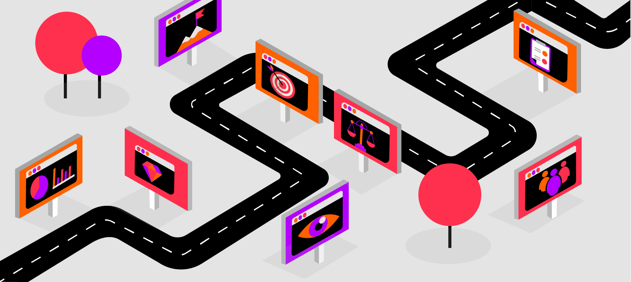
5 Tips on Designing for Accessibility
I think we can all agree that designers have a lot on their mind when designing the UX for a new website or app. And this may be one of the main reasons why they sometimes forget one crucial thing - making their digital product accessible to everyone, regardless of ability or context.
Accessibility in UX design is incredibly important because it helps deliver a much better experience to everyone, with no exceptions. This means that as a designer you need to be inclusive to the needs of all users, including those with visual, speech, auditory, or physical disabilities, so your product can serve as many people as possible.
But you first need to understand what those needs are so you can optimize your designs accordingly. If you’re not sure where to start, let’s take a look at 5 key areas for building accessibility into your designs.
Be mindful of color
Color plays an important part in design. It’s a powerful way to convey emotion in your designs or create a specific mood. Colors can evoke literally hundreds of different responses and, when properly used, can help strengthen perception of a company or a brand.
However, for the visually impaired, the power of color diminishes. So let’s quickly put things into perspective. According to Color Blind Awareness organisation, color blindness affects approximately 1 in 12 men and 1 in 200 women in the world.
Some colorblind people see no perceptible difference between red, orange, yellow, and green, and these colors are very much different to the average viewer.
So what can you do?
Start with color contrast
The lack of proper contrast ratio is one of the most common accessibility issues. People with impaired vision will have difficulty reading text from a background color if it has low contrast so it’s important to have sufficient contrast between text color and its background. You can use a color contrast checker to make sure you’re on the right track.
Don’t rely on color
If you rely on color only to communicate crucial system information or alert messaging, people with visual impairment will have difficulty perceiving them as important.
To ensure accessibility for things like error or success messages or system warnings, make sure to incorporate messaging or iconography that clearly states what is happening.
This also applies to Primary Buttons. Designers often use color to draw users’ attention to them and present them as buttons that they’d use to take a primary action. What you can do instead is use size, placement, boldness, contrast, or icons.
Ensure accessible controls
Controls are any UI elements that users can interact with, including links, buttons, and checkboxes. If the area for clicking/tapping controls is too small it will be difficult for users who cannot be precise with a pointer to activate them. Same stands for controls that are placed too close together. Even if you provide a label that could be clicked on instead, not all users know they can do so.
Make images “readable”
How do you make images on your website accessible to users who can’t see them and who use a screen reader to understand the content on your website? You need to tell them what the image represents or what information it conveys.
This is why you always need to use alt text for the images to describe the context so the screen reader can explain them. However, if the image is there for purely decorative reasons you can leave out alt text to avoid distracting the screen reader user from important content.
Enable keyboard accessibility features
Keyboard accessibility is a key aspect of an accessible design. Many users would use a keyboard instead of a mouse or trackpad, including users with mobility disability, tremors, or those using a screen reader.
These users are typically accessing content through a keyboard, more precisely by pressing the ‘tab’ or ‘arrow’ keys or through alternative input devices. For this reason, all functionality on your website/app must be accessible via keyboard - links, buttons, forms, and other controls.
It’s also crucial to make sure that the tab order matches the visual order, so users who use keyboard can browse through site content in a logical manner.
Perform usability tests
No matter if you’re optimizing your existing website or app design to be more accessible, or designing a new digital product from scratch, there’s a pretty good chance you’re going to miss something. There are many guidelines to follow and some may simply not be applicable to your digital product.
But, if there are some systematic accessibility issues, usability testing is the best way to uncover them. And the earlier in the design process you start, the better!
You can leverage usability testing in the wireframing or prototyping phase to see how your target users (including those with disabilities) move through your website or app. You can also usability tests on existing products to identify any pain points and prioritize any changes that you need to make.
Conclusion
These are just a few tips to make your product more accessible from the UX perspective and they definitely do not encompass all guidelines to accessible design. However, they’re a good place to start! To learn more about accessible design, head over to the Web Accessibility Initiative website.