Why Illustrations Matter in UX Design
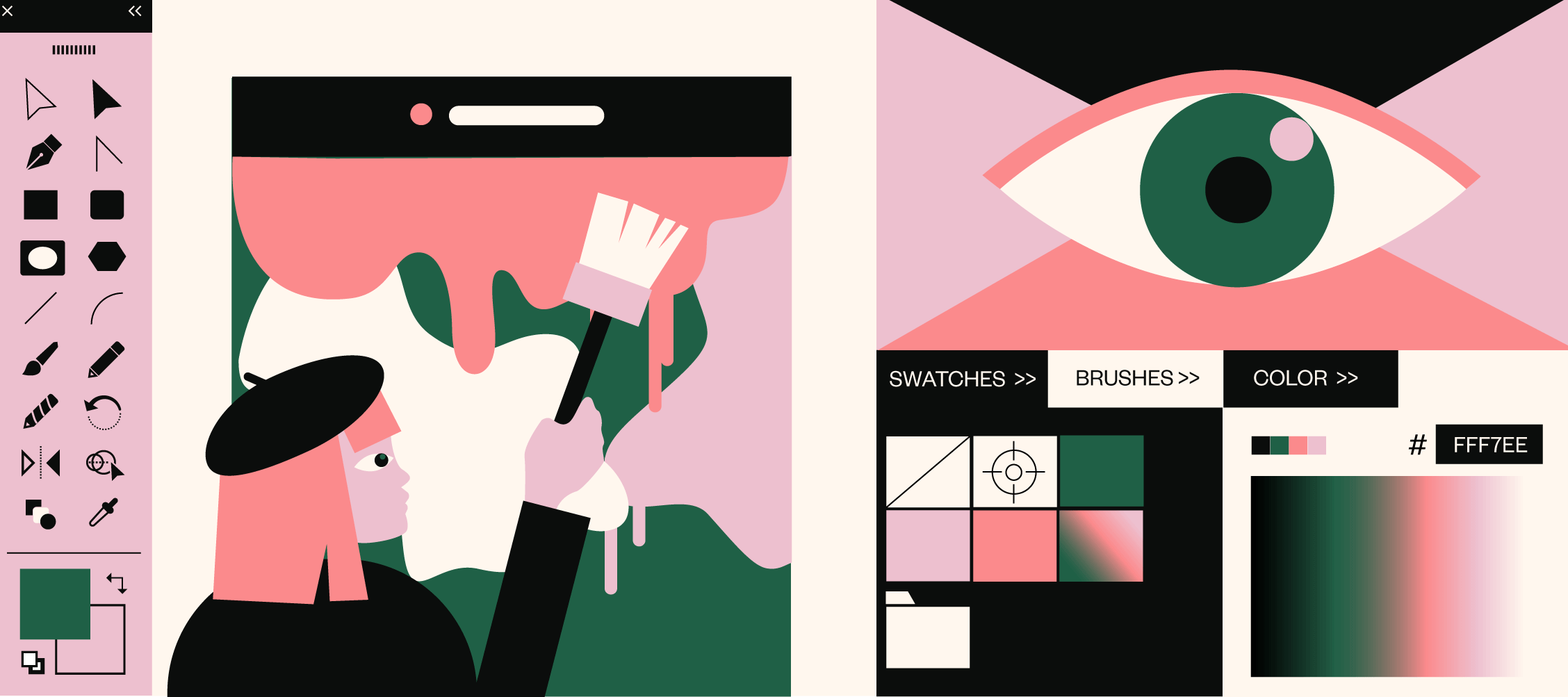
Illustrations have become an important part of user interfaces, serving both as a functional element and a tool for communicating and delivering brand or product messages.
More than any other UI element, illustration can clarify complex ideas, concepts or processes by interpreting them visually. But it goes even deeper than that. Illustrations help digital products to establish an emotional connection with users.
This should be their main purpose - to create a connection, build a narrative, and enable a smooth user experience where making a decision is effortless for the user.
A huge number of websites now use illustration more than photos as a way for their brand to effectively reach their audiences and their product to stick in their users’ minds.

But, is illustration a good idea for every website and every product?
Absolutely not.
It’s the UX designer’s responsibility to figure out whether illustration can add value to the product by improving the UI/UX. And, more importantly, can it empower users to be more successful with the product?
Creating illustrations just for the sake of beautifying the UI, without a specific context or function, certainly isn’t a good enough reason to use them.
Now, let’s look at four strong use cases for illustration
Build trust
One of the best reasons to use illustrations in your UI is to build trust in your product. But how can illustration achieve this?
By giving a more personal tone to the way you communicate with users, illustrations can make your brand seem more human and more approachable. This sense of human connection in a digital world is what truly helps build trust.

Keep in mind that illustrations you add to your UI need to follow your design language while keeping the focus on the user.
Ease of understanding
Good UX design starts with understanding user behavior patterns, their goals, pain points, and expectations as they interact with your product.
If you can pinpoint all of the above, you’ll have all the insight you need to create illustrations that will help guide users and set a positive user experience. The goal for your illustrations is to help users understand exactly what is going on without having to wonder what to do next or how to do it.
That’s why onboarding is such a good example of this use case - illustrations help engage users and lead them through the onboarding process while reducing cognitive load.
Brand Identity
Illustrations are highly effective in making a UI design recognizable and supporting the website or digital product branding. They appeal to users’ imagination to establish a stronger personal connection with them.
Brands that maintain a unified illustrations style on their website, app, and social media channels benefit from people automatically associating the design with their company.
Content Enhancement
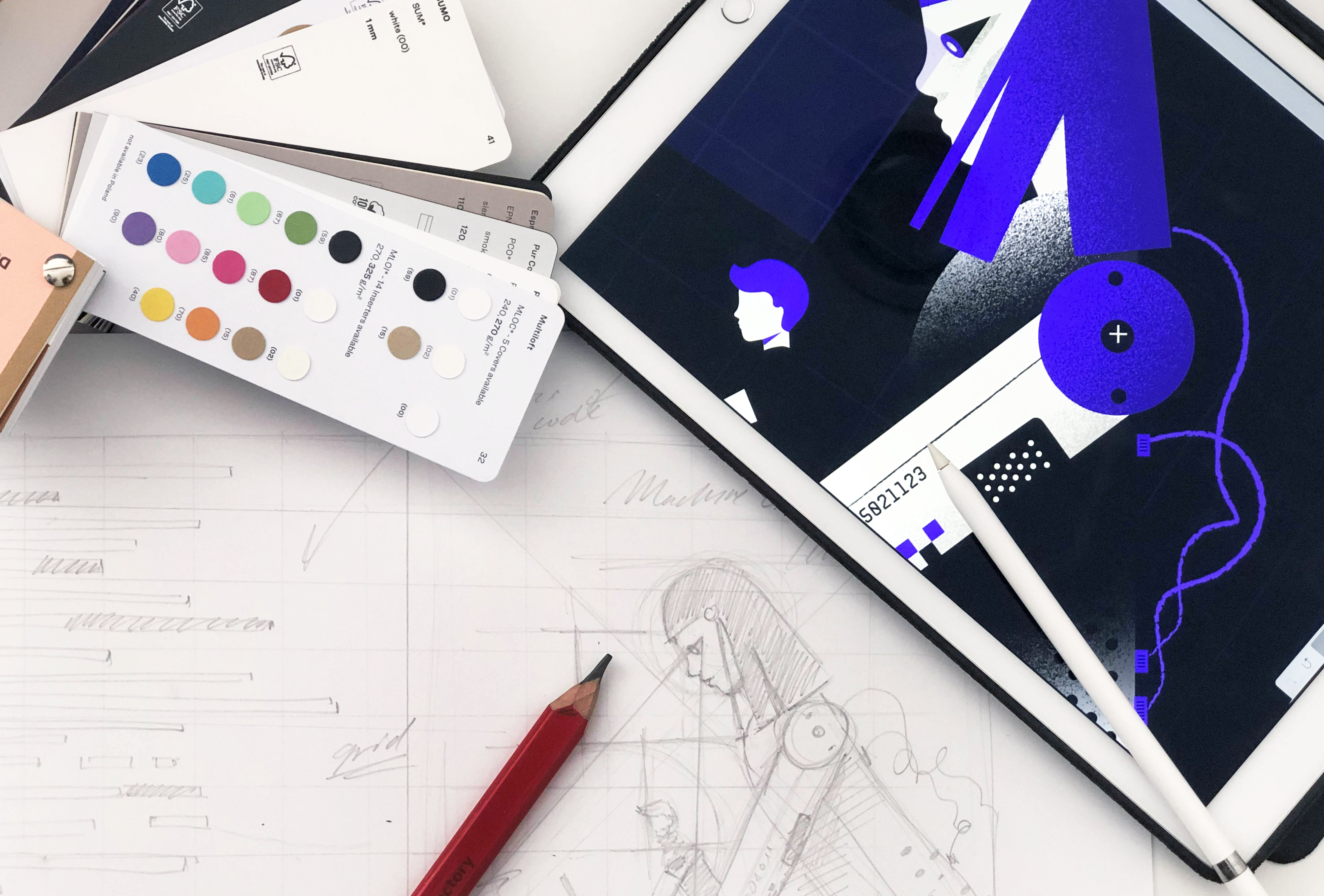
At SpiceFactory, we use illustration to make stories alive and to share not just what we think about a certain subject but also how we feel about it. This way we are building a stronger connection with users.
Illustration gives a necessary human touch to Web content and, with its style, represents a certain moment in time. Internet is full of everything, our attention spans are getting shorter, and without effective illustration, it would be impossible to make your story memorable.
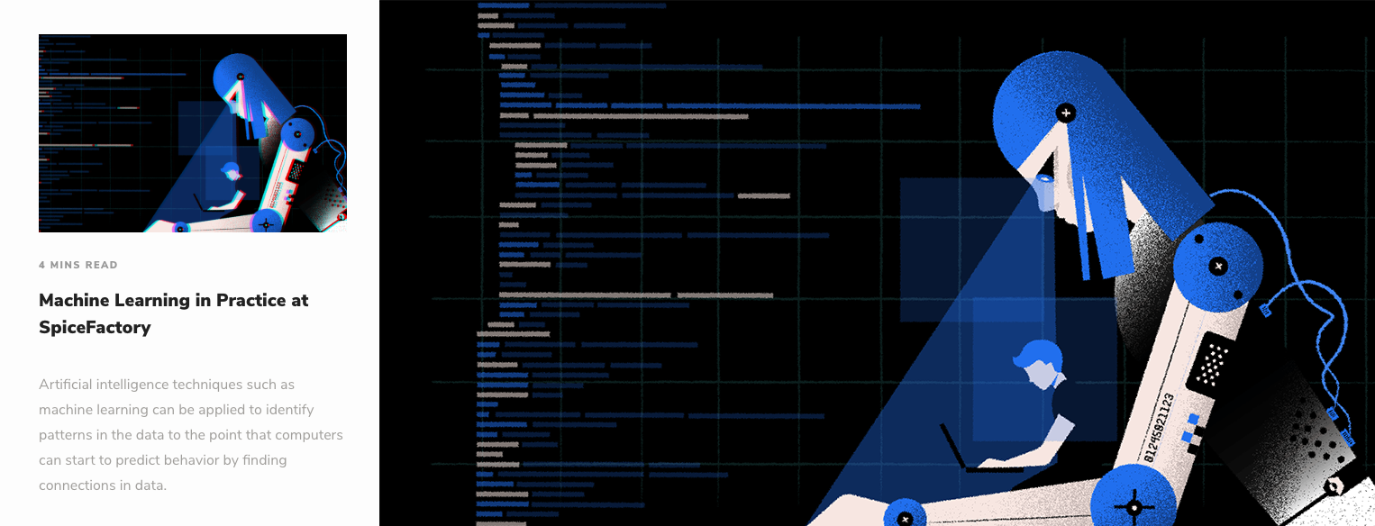
For example, if you create an illustration that serves as a featured image for a blog post, you can get really creative because you won’t have to follow strict design language like for UI illustrations. You only need to make sure its related to the content of the blog post!
Here’s an example from the SpiceFactory blog:
Takeaways
Illustrations can make a website or app more user-friendly by explaining complex ideas, fast, showing empathy towards users, and adding a human touch to the UI. It’s an amazing tool for catching your user’s attention but it also helps build trust and develop a deeper, long-lasting relationship with them.
